
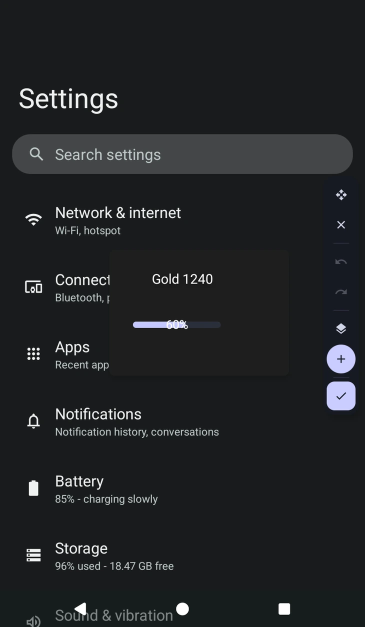
The scene builder
A scene is a HUD you lay out visually. It is saved on the macro, the same way a or a is, so it travels with the macro and any action can show it by name.
You reach the builder from an Overlay action, through Open the scene builder or Manage scenes. The scenes list is where you add, rename and reorder them; a macro can hold as many as you like.
The canvas
You are drawing on top of your actual screen, at actual size, so what you see is what the macro will draw. Drag widgets to move them, and use the toolbar for  undo and
  redo. The toolbar itself can be dragged out of the way.
Three panels hang off it: Add for new widgets, Properties for the selected one, and Layers for everything in the scene.
Positions are stored as pixels on this screen, and other screen sizes are handled for you. Place it once and it lands right everywhere, so there is no anchor to pick and nothing to work out. See for how that works elsewhere in the app.
The widgets
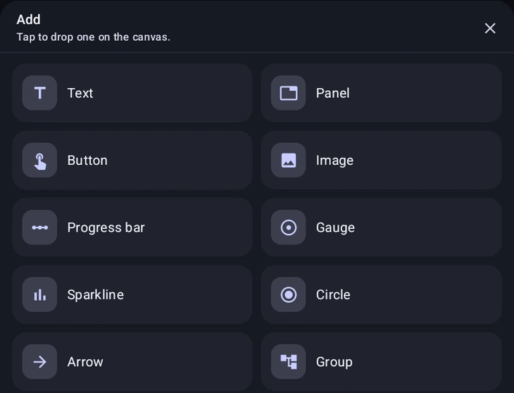
Add offers ten:
- Text, a label. The workhorse.
- Panel, a filled box. Usually the background everything else sits on.
- Button, a tappable label.
- Image, one of this macro's templates.
- Progress bar, horizontal or vertical.
- Gauge, an arc dial.
- Sparkline, a rolling line chart that scales itself to whatever numbers you give it.
- Circle and Arrow, simple shapes. The arrow points right; use Rotation to aim it.
- Group, a frame you put other widgets inside.
Making it live
This is the part worth understanding, because it is what separates a picture from a HUD.
Type a %variable% into a field and the widget follows it while the macro runs. Put %score% in a Text widget's text and it re-draws itself every time the variable changes, with no Overlay action needed. The same works for a progress bar's Value, for colours, and for width and height.
Width and height also take 50%, auto, or a %token%, so a bar can be sized from a variable as well as filled from one.
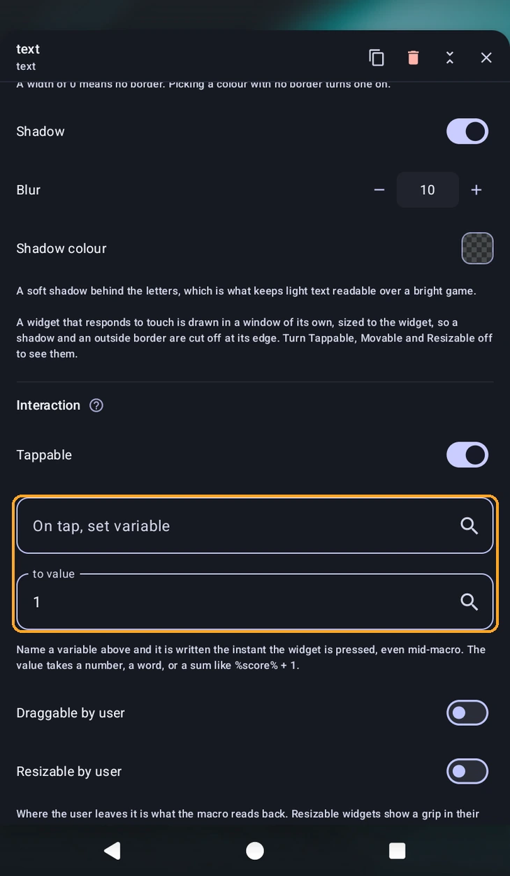
Interaction
Under Interaction, and applying only while the macro runs, never in the builder:
- Tappable, makes the widget accept presses. This is what an Overlay action's Wait mode reads.
- On tap, set variable and to value. Name a variable and it is written the instant the widget is pressed, even mid-macro, without waiting for anything. The value takes a number, a word, or a sum like
%score% + 1, which is how you build a counter button. - Draggable by user and Resizable by user. Where the user leaves it is what the macro reads back. Resizable widgets show a grip in their bottom-right corner while the macro runs.
A widget that responds to touch is drawn in a window of its own, sized to the widget. That means a drop shadow or an outside border on it gets cut off at its edge. Turn Tappable, Movable and Resizable off if you need those to show.
Groups
Drag a widget onto a group and it joins; drag it off and it leaves. Everything inside is measured from the group's corner instead of the screen's, so moving or hiding the group takes it all along, and one Hide can take down a whole panel of things.
Clip contents cuts off anything sticking out past the group's edge. A group can also be made draggable, and it carries its children with it.
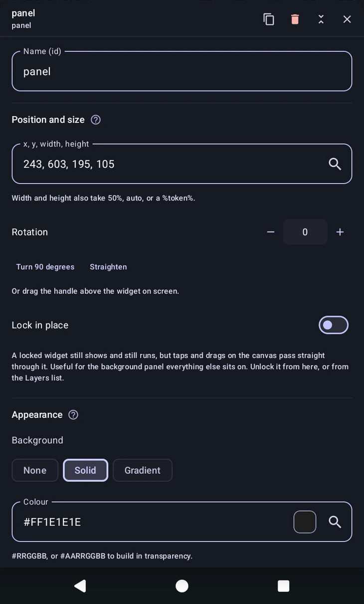
Layout and styling
- Position and size, typed as
x, y, width, height, plus Rotation which you can also drag by the handle above the widget. - Lock in place, a locked widget still shows and still runs, but taps and drags on the canvas pass straight through it. Exactly what you want for the background panel everything else sits on.
- Text, size, colour, alignment, weight, font, italic, line height, letter spacing, max lines and an ellipsis.
- Appearance, a background that is None, Solid or a multi-stop Gradient, plus corner radius, padding and opacity.
- Effects, border width and colour, whether the border sits inside or outside the widget's box, and a shadow. On a text widget the shadow falls on the glyphs, which is what keeps light text readable over a bright game.
Colours are #RRGGBB, or #AARRGGBB to build in transparency. If something looks see-through when you did not expect it, the builder tells you why rather than leaving you guessing: a template is transparent wherever its mask is, and some widget kinds have a part-transparent default fill that Opacity fades on top of rather than undoing.
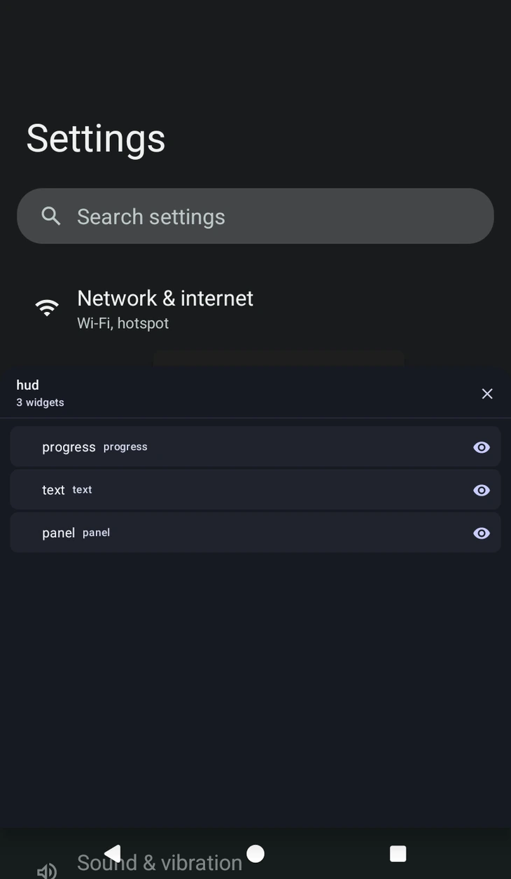
Layers
The Layers panel lists everything in the scene, groups folded. From here you can select, reorder front to back, hide, lock, copy, paste and delete, which is far easier than hunting for a widget you have buried under a panel.
Naming
Every widget has a Name (id), and that is what an action or a script uses to reach it. Two widgets in a scene cannot share a name, and a blank one is refused, so the old name is kept in both cases.